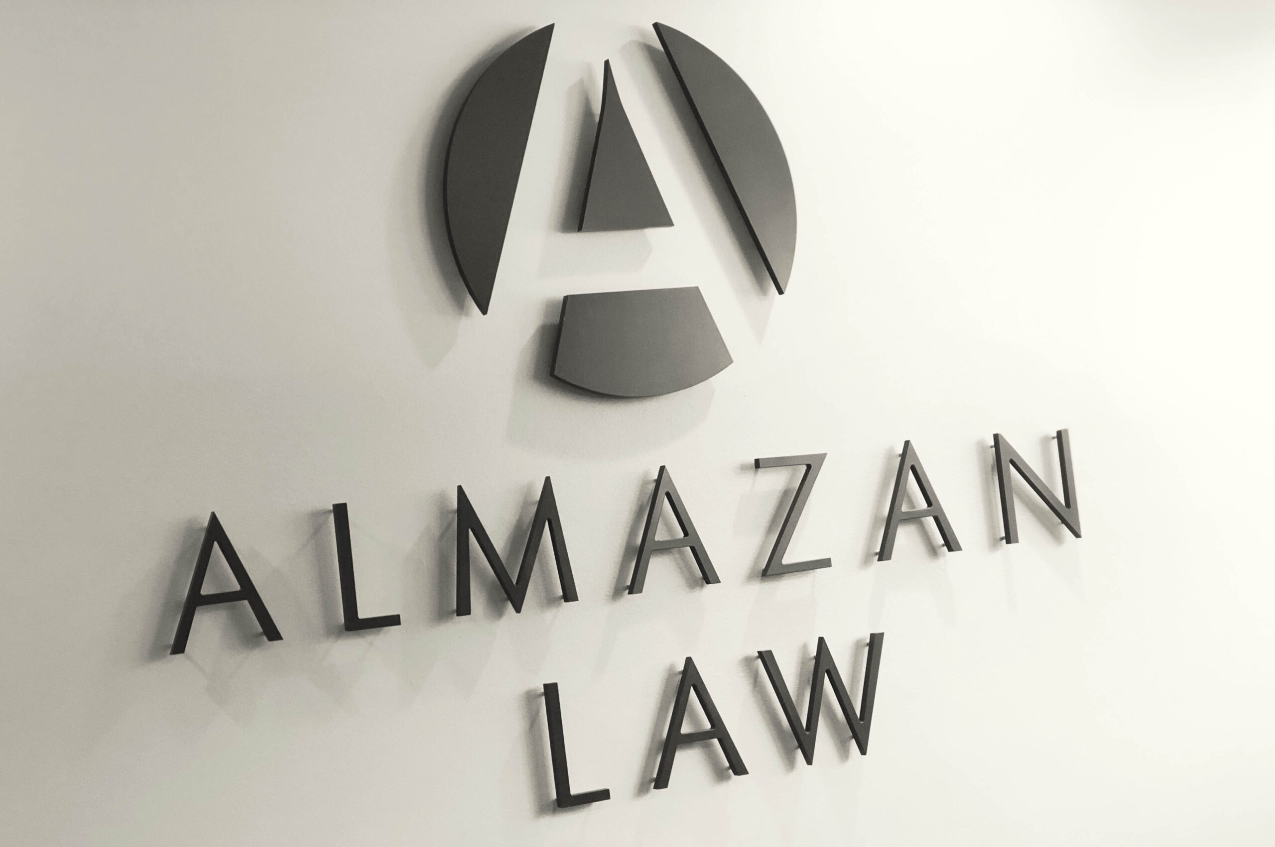

From the the first meeting with the client, the princiapls of Almzan Law made it clear that the law firm's identity should not reflectyour typical, calisic, almost expected, lawyer-looking branding. Their approach to the law practice process used new approaches to streamline how the work was done and their identity needed to reflect this.

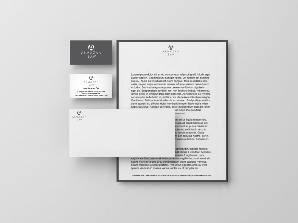
Clean lines and a bold "A" emerging from a black circle produced the superhero-esque mark that headed the san-serifed typography and defined negative spaces used in the collateral and signage created for the lawfirm's brand work.